The 50mm (35mm equivalent view angle) lens of the A12 means I have to crop to get this.
I like to start usually with adjusting the white balance, the dropper tool is good if there is a point of reference, basically anything that is suppose to look white. Otherwise, it depends on your eyes.
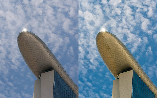
Next is the tricky part, lighting. This case I wanted the building to shine, you can use the usual sliders or the curve tools. A good tip I learnt is to use the highlight clipping indicator, as well as the black clipping.

The section marked Presence can help give the extra kick. Vibrance will up hue saturation, but only selectively unlike Saturation is all across the board which can give a nasty posterized look.
In the Tone curve, you can adjust the curve through the sliders or the curve directly. Another interesting way is the area tool (circled red), click it, go to the picture and click-hold at the area you want to change and simply move the mouse up or down to lighten or darken.

When you find some area seem too bright or shaded, you wan to use the Brushes tool, which allows you to "paint" in your desired lighting. To show up the pattern in the under surface of the Sky park in my example, I use the brush to increase contrast just there, there is even an Auto Masking option to help paint within the "lines".

I had also pumped up the Yellow saturation to give the building a golden look.
Any way, this is just my experience with Lightroom, but I still have a lot to learn. One good way of learning is actually to teach what you know, it really helps with the process.
No comments:
Post a Comment